A Living Space with Practical Considerations
Personalized Apartments
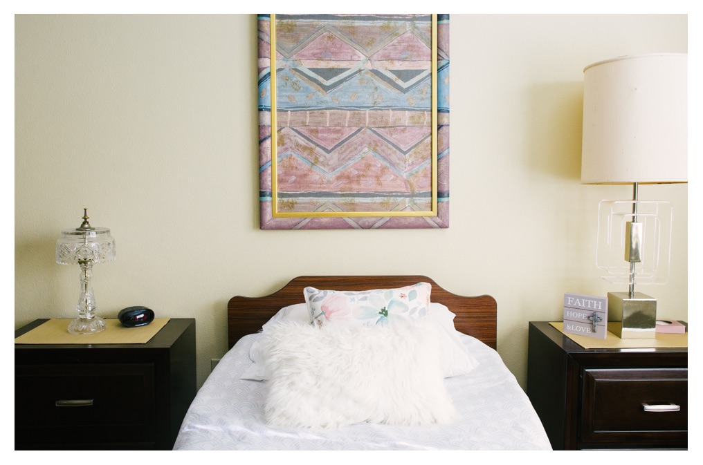
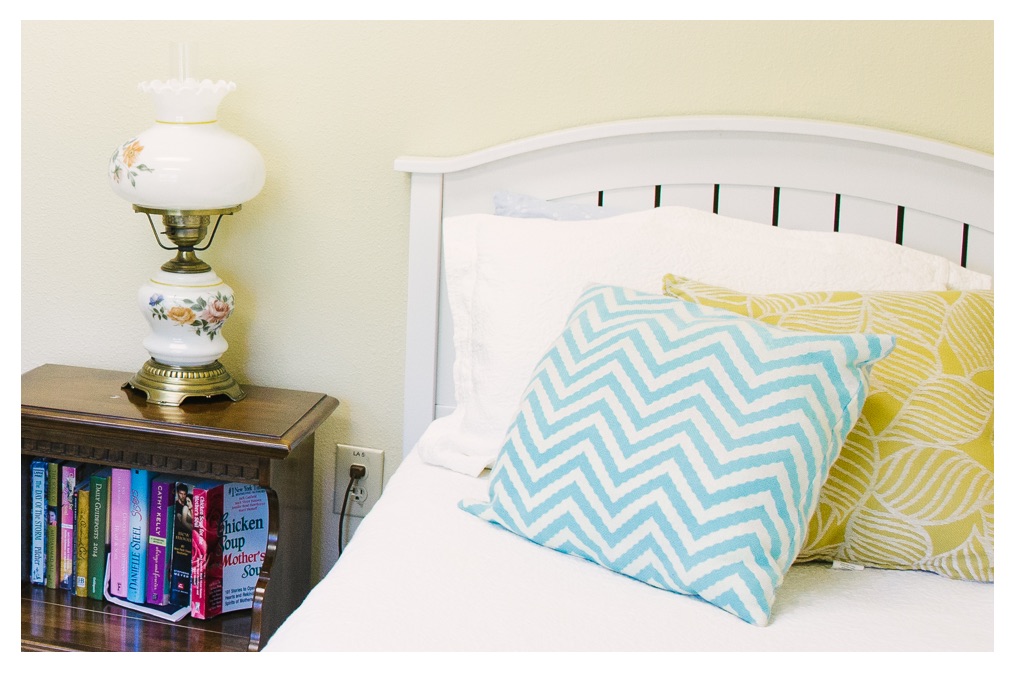
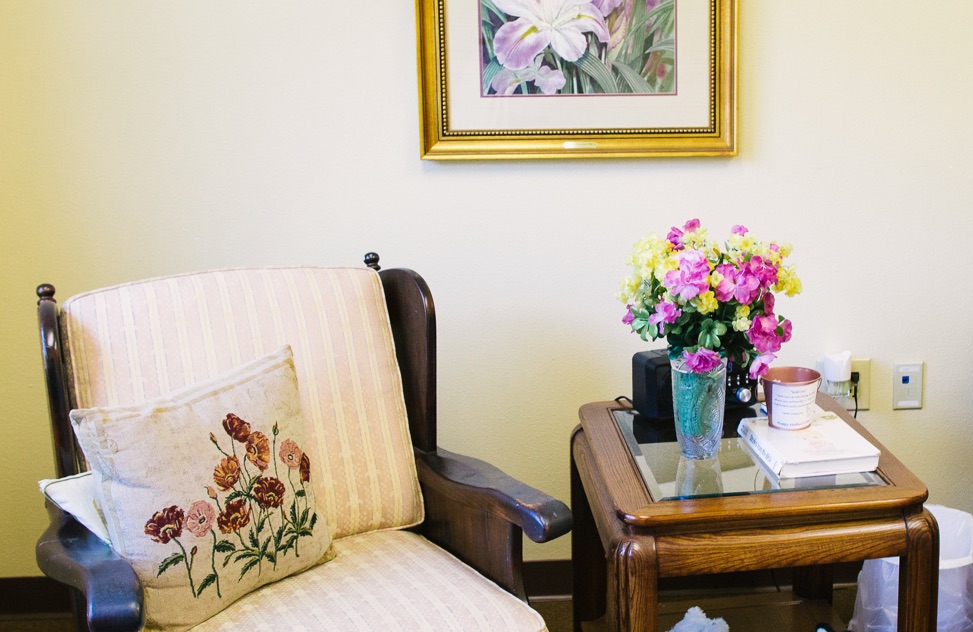
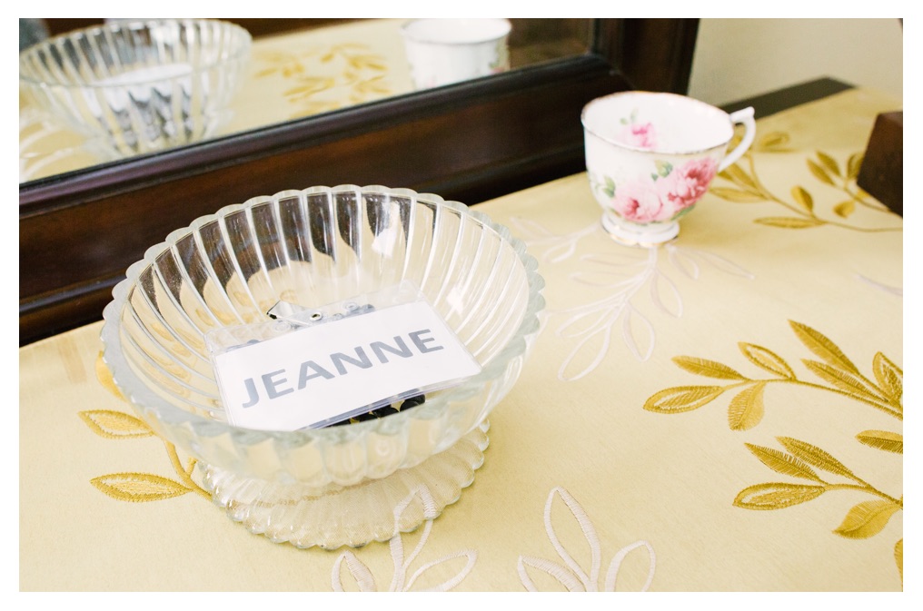
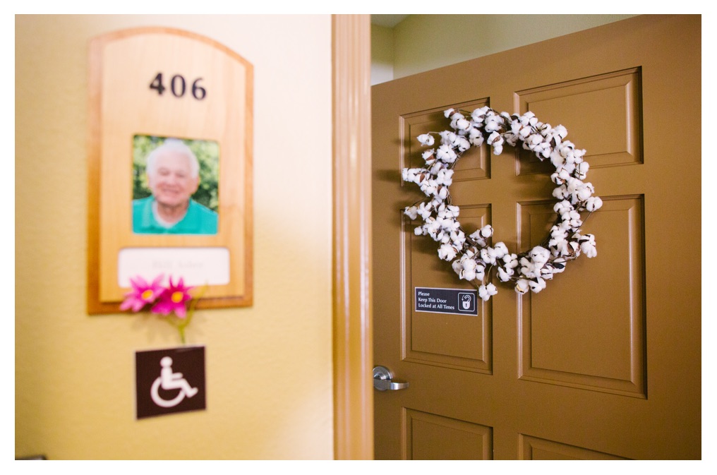
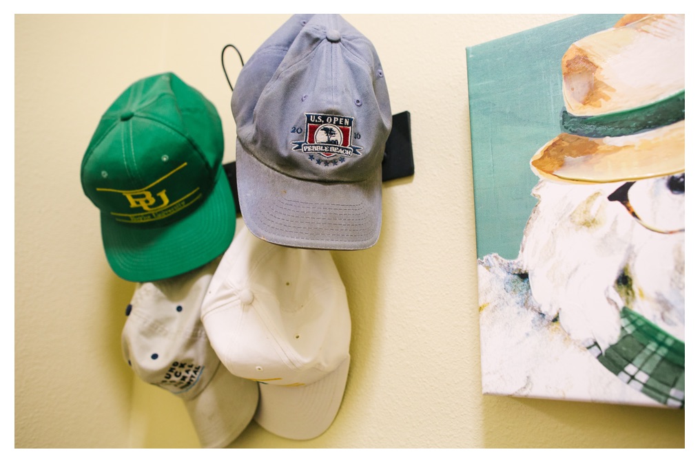
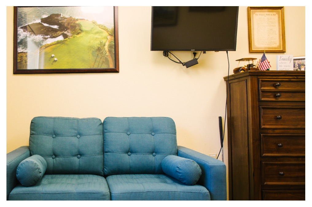
Family members are encouraged to help decorate their loved one’s new home with personal touches and familiar objects. Each resident also has a personalized wreath on their door to help signal which apartment is theirs.



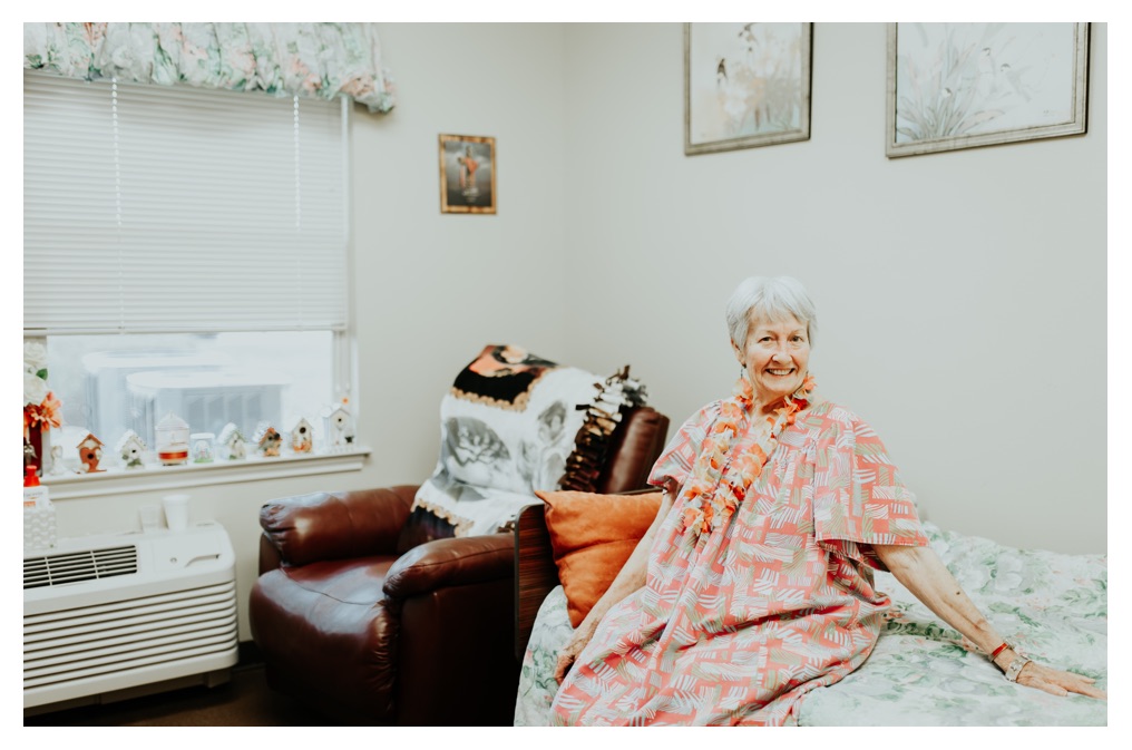

Need-Based Care
Our communities are designed for safety, with certain precautions on one side of the house versus the other based on the level of cognition.
Normalized, Simple Design
We don’t use terms like “dining hall” or “gathering space,” instead we call our spaces what they are—the living room, dining room and kitchen.
Details in Common Areas
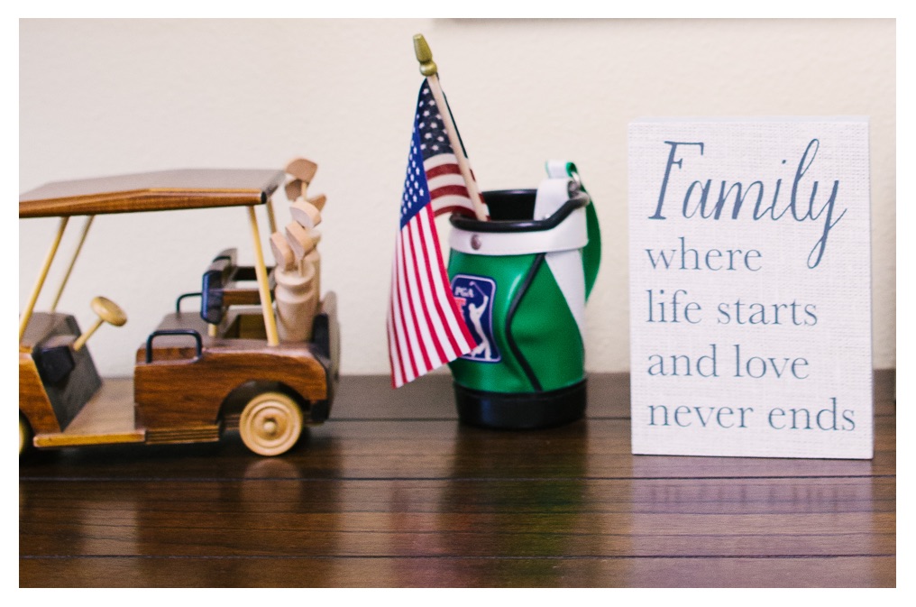
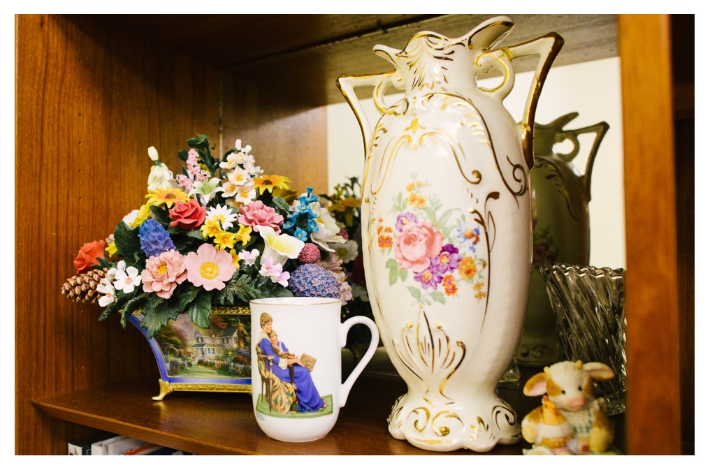
Part of every home is the decor that hangs on walls and sits on shelves. Our locations are designed with similar little touches to further emphasize that Sundance truly is home for everyone who lives there.
Thoughtful
Details
Red Plates
At Sundance, our plates are red. Macular degeneration often accompanies memory care needs. Mashed potatoes and gravy or other neutral-colored foods will often blend in with a standard, clinical white plate.

Floor Plan
Each community floor plan is designed to redirect residents naturally, with line-of-sight cues. Our floor plans have short, wide wings that flow toward the center activity area and is flooded with natural light during the daytime and indoor lighting at night so it’s never dark in the hallways. Each wing only has 10 apartments, so your loved one sees their same friends when they wake up and go to bed every day.
Hand Rails
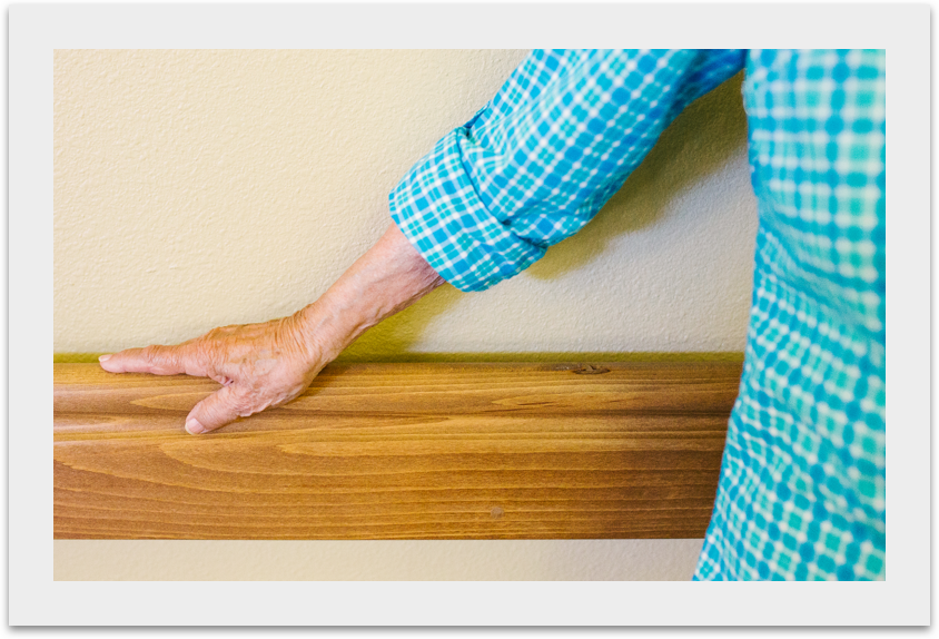
On your next visit to a Sundance community, slide your hand behind the solid wood handrails that run the length of our walls. You will notice they are anchored to the walls with solid wood. This prevents skin tears in aging skin. When we say “every detail matters” …we mean it!
Verb First, Line-of-Sight Sinage
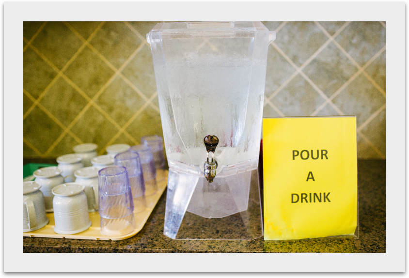
Yellow signs placed in line-of-sight direct residents to independently care for themselves by accomplishing everyday activities like pouring glasses of water, returning books or playing music.


